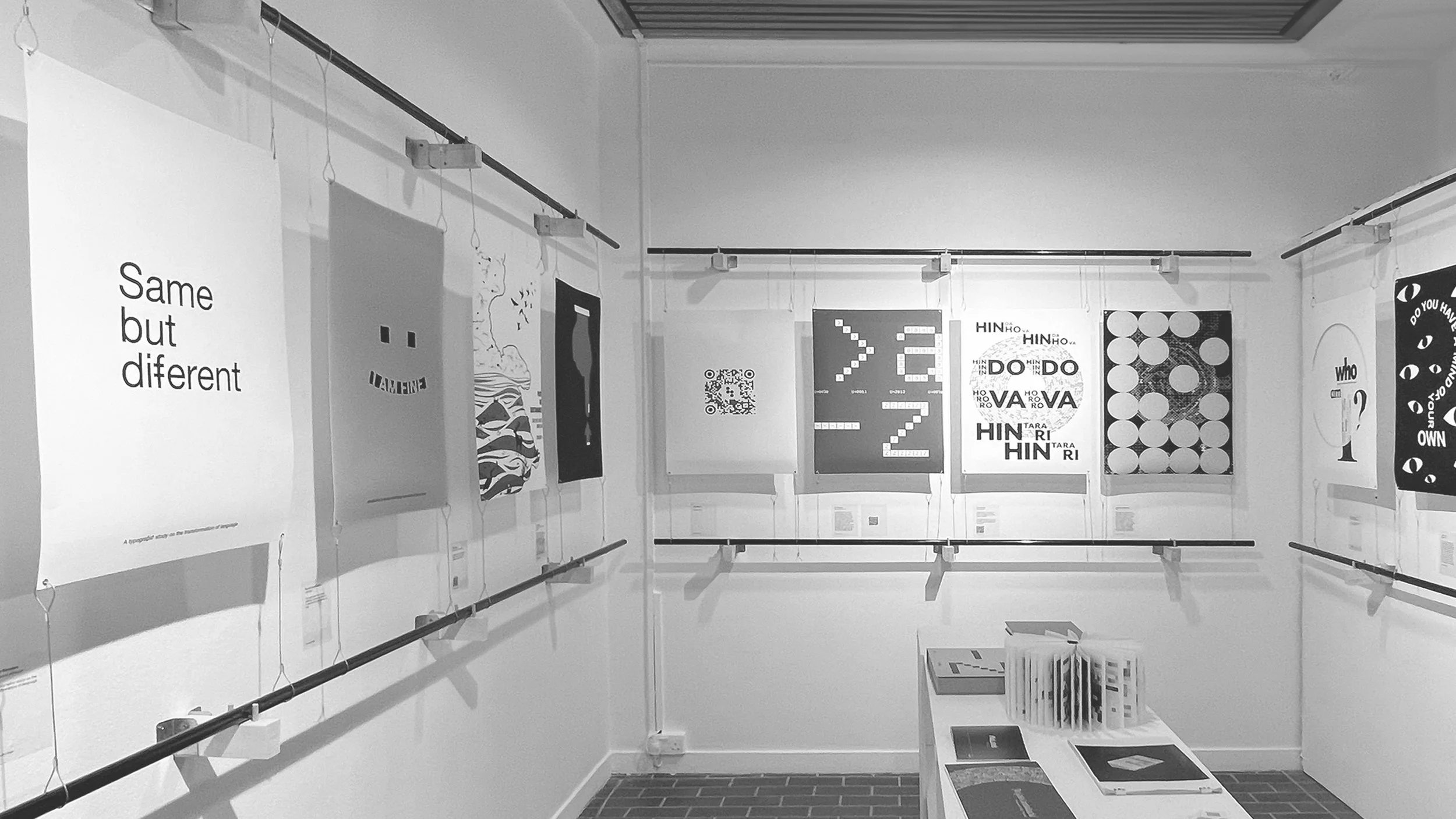
Same but different:
A typographic study about the transformation of language.
MA Graphic Design - Arts University Bournemouth - Final project
This study explores potential ways in which additional glyphs and ligatures could be introduced alongside existing ones to represent phonemes and pronounced sounds in a form that visually corresponds more closely to their sounds.
Some explorations involved combining two characters, others borrowed elements from different characters to create new ones, and some merged double letters into a single form. Certain ligatures can function as letters usable in body text, while others are suited for display purposes.
With deeper research into the transformation of language, typography, reading, and phonetics, this case study stands out within the context of technological developments, innovation, and changing reading practices in modern times. It explores the possibilities for refining and enhancing typography and language in comprehensive ways, examining what they could look like from a variety of perspectives.
Therefore, this book showcases each of the new characters individually and in context, along with a few animated typographic compositions using some of them.
Video
A short video highlighting various aspects of the project.
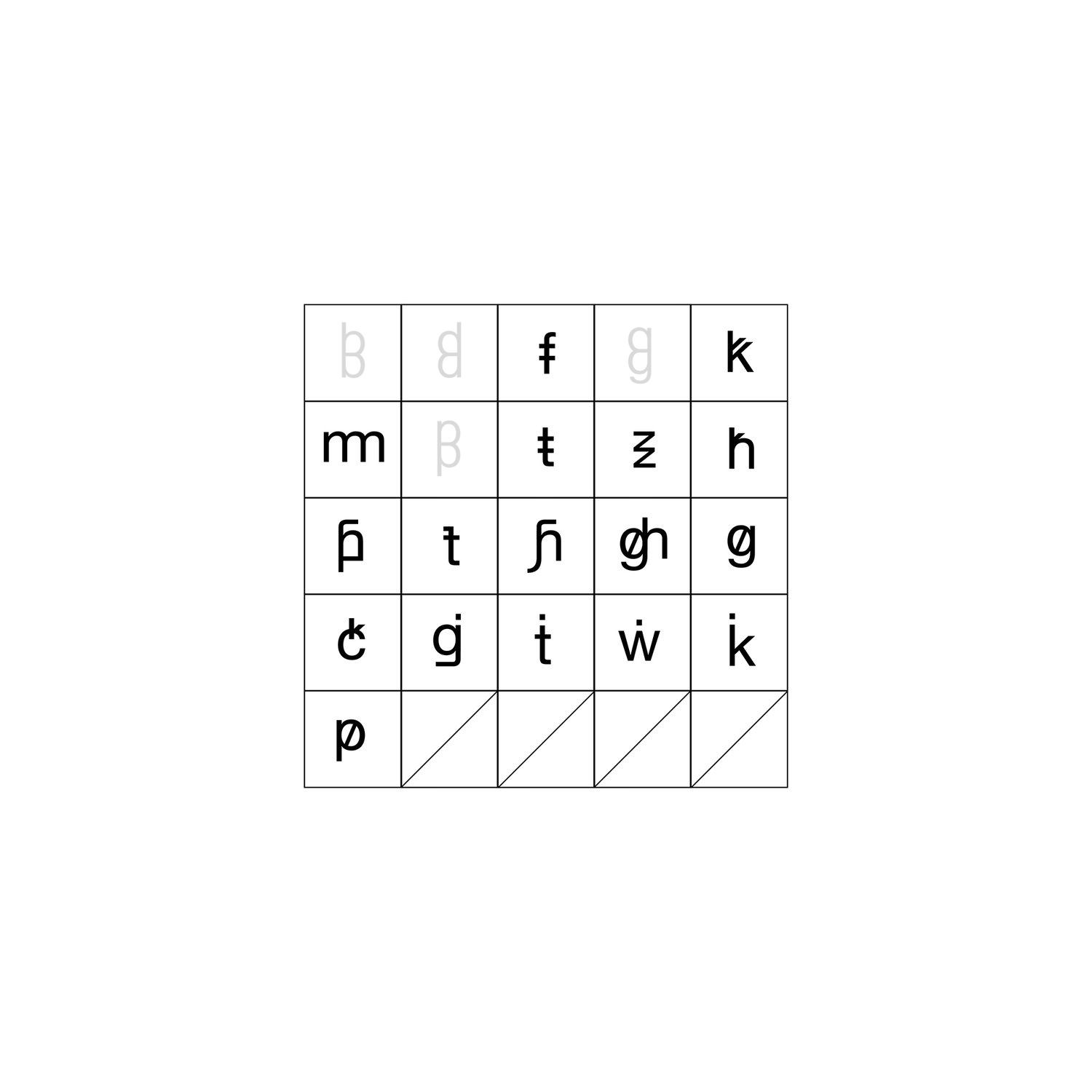
All ligatures
All ligatures created, including the "display" ones. Display ligatures are not intended for use within body copy, as they extend beyond the ascender and descender lines.
Each ligature is crafted according to a grid and conforms with other letters, so they are not randomly drawn elements added to the letters. You can notice and see that further down on this page in the book.
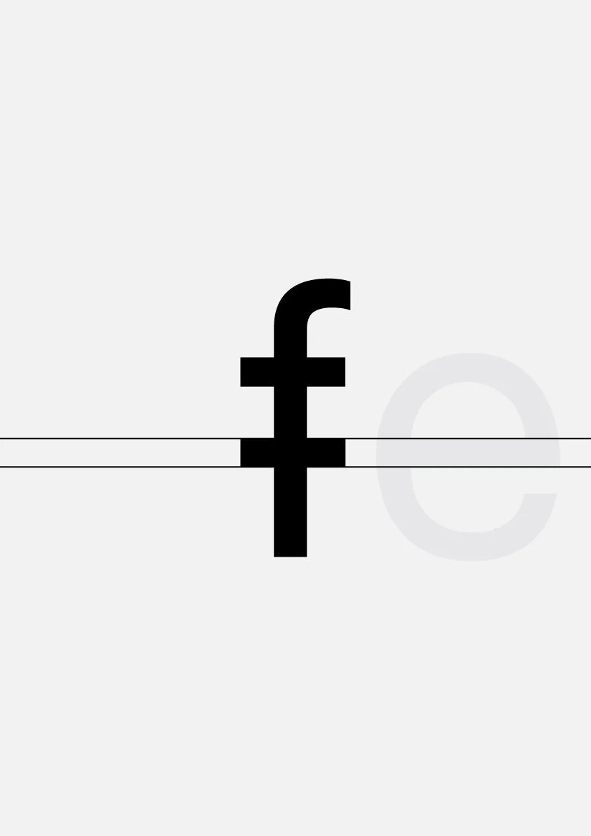
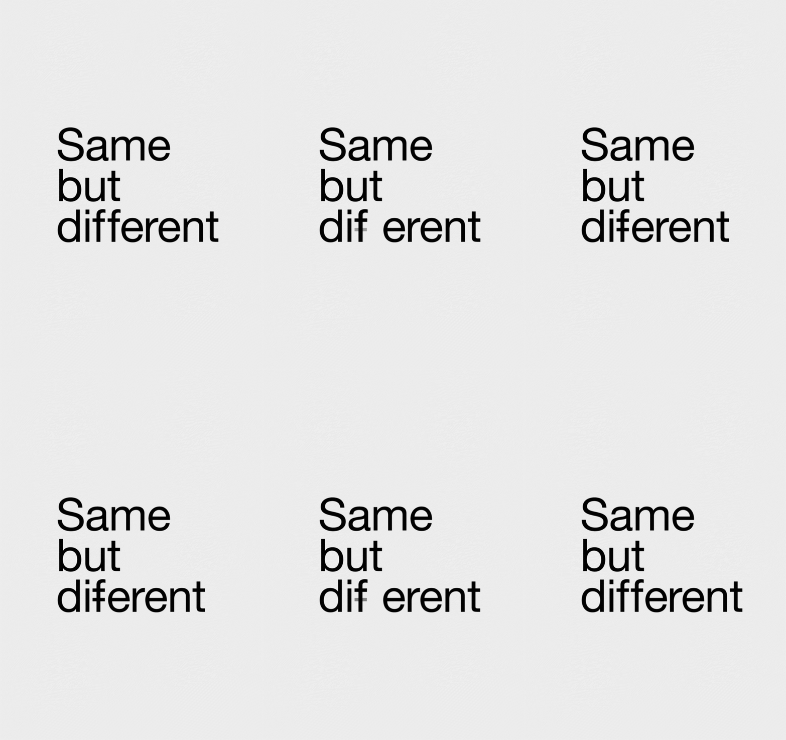
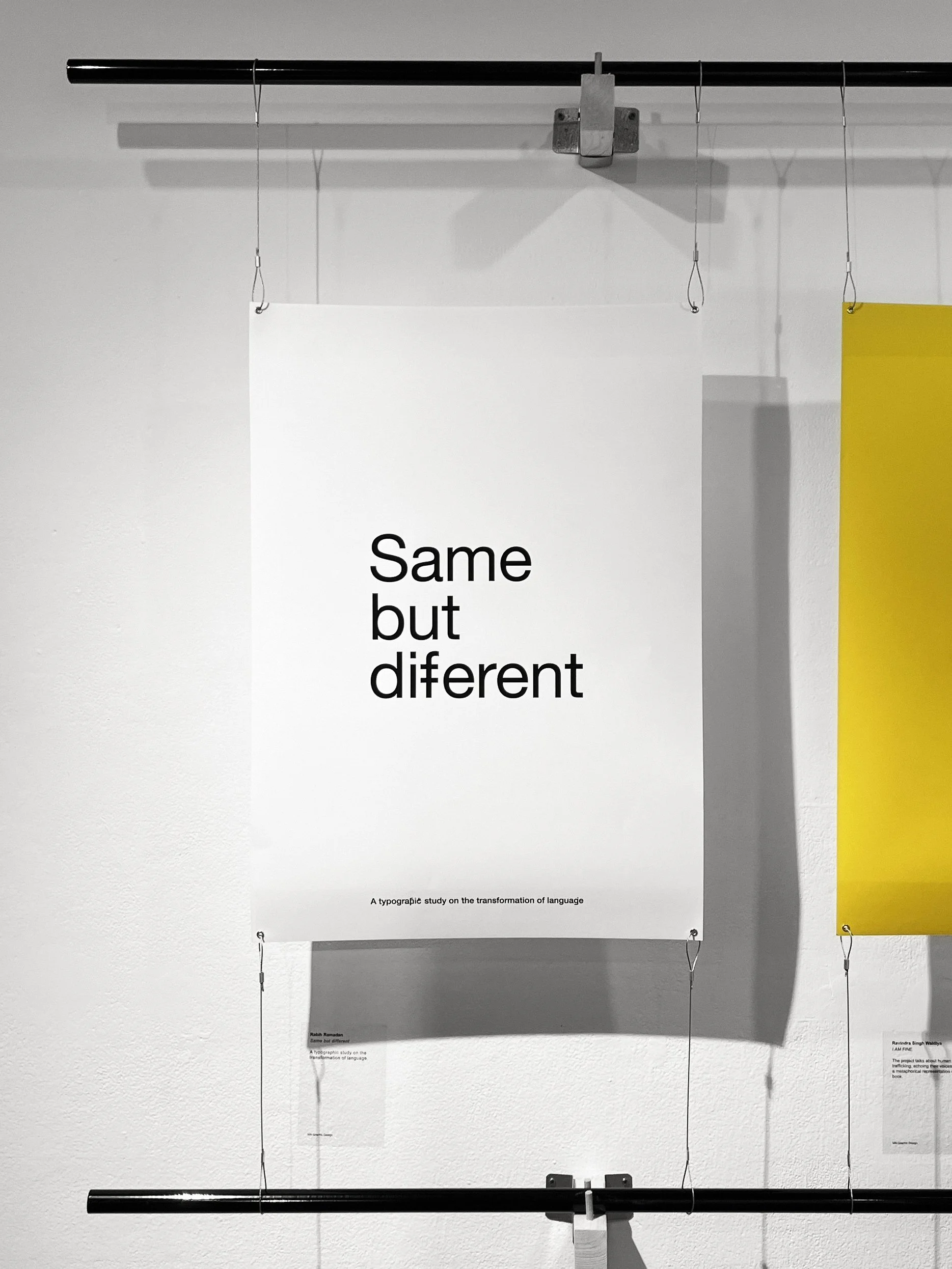
The main animated poster for "Same but Different" showcases the double "f" as the distinguishing element.
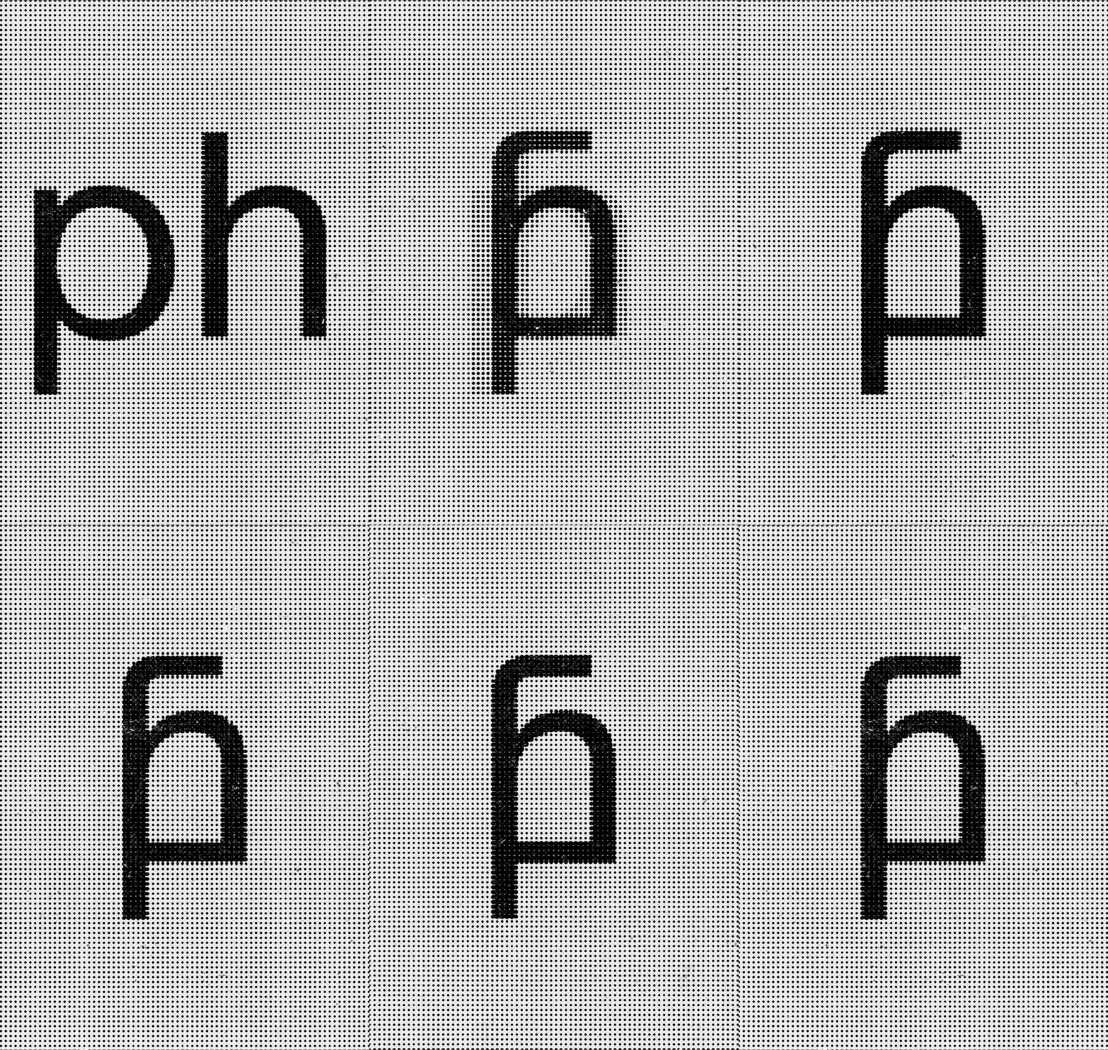
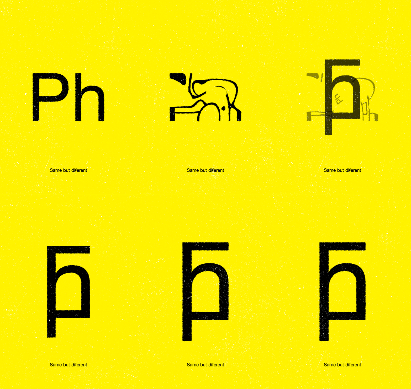
p + h = f
A lowercase "p" combined with "h" turns into a ligature that sounds like "f."
P + h = F
An uppercase "P" combined with "H" forms a ligature that sounds like "F."
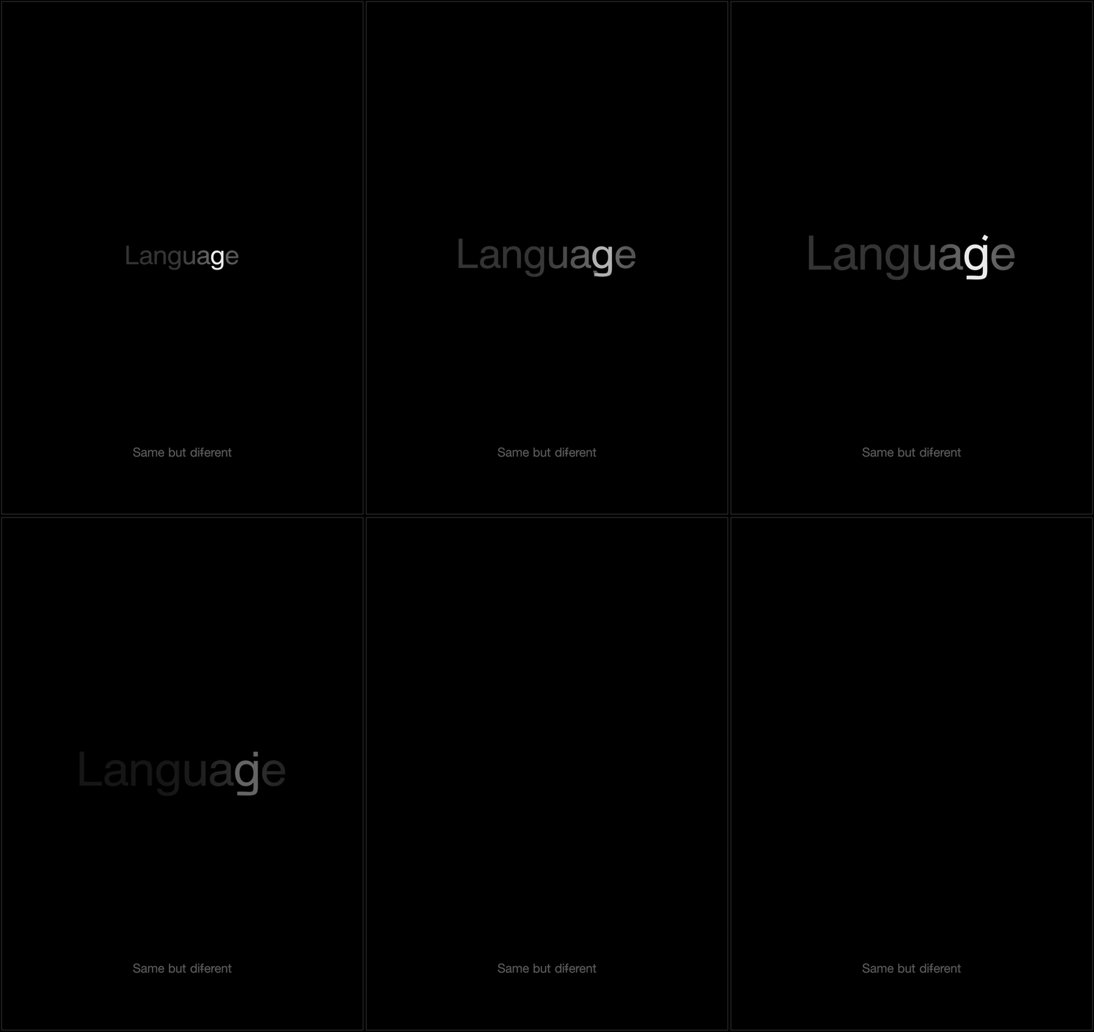
g = j
An animated poster showcasing a ligature for the letter "g" that sounds like a "j."
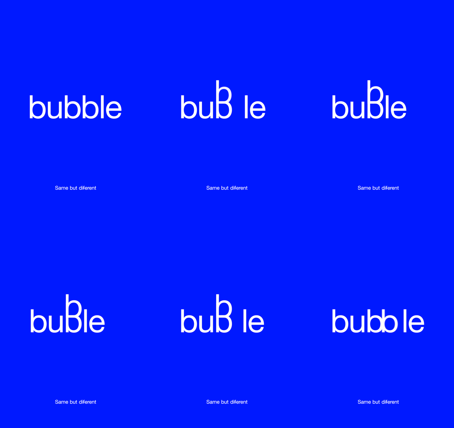
double “b”
An animated poster showcasing a ligature for the combined letters double "b." This is one of the ligatures primarily intended for display and decorative use only, as using it in body copy would not be ideal for line spacing or leading, because these display ligatures extend outside the ascender and descender grid, potentially disrupting text alignment and readability.
The book (final project)
This is a preview of the book, not the entire work, as the complete book will soon be available for purchase.
Contextual Journal:
The "Contextual Journal" is a research and work-in-progress diary that documents the thinking process leading to the final project above.
In order to rethink and reconsider how we view the alphabet and language, I conducted research by reading books, exploring typography and language in our surroundings, and experimenting with mini-projects, allowing me to see things from a fresh perspective.
